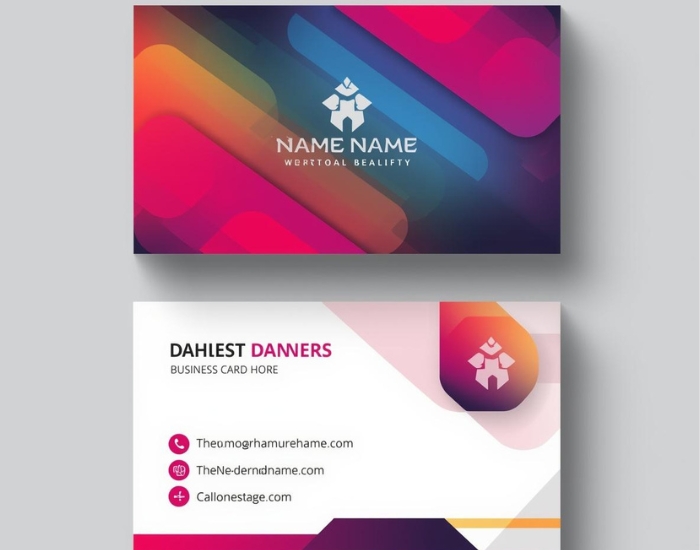

To build a consistent brand identity, use the same logo, colors, fonts, imagery and tone of voice everywhere customers meet your business, from your website and social media to business cards and signage. The simplest way to do that is to document those choices in brand guidelines, build templates from them, and review your channels regularly. For Phoenix businesses competing for attention, that consistency makes you easier to recognize and easier to trust.
What Is Brand Identity Consistency?
Brand identity consistency is the uniform presentation of a brand’s visual elements, messaging and personality across every touchpoint. Logos, color schemes, typography, tone of voice and imagery all look and sound the same, so customers can recognize and connect with your business wherever they find it.
For a Phoenix business, that means a website visit, an Instagram post, a printed brochure and a storefront sign all communicate the same professional, cohesive identity.
Why Consistent Branding Matters for Phoenix Businesses
First impressions happen everywhere: online, in print, on social media and in person. Every interaction is a chance to reinforce your brand, or to confuse people. When customers see a uniform brand, they tend to perceive the business as professional, reliable and memorable. Over time, that familiarity supports credibility, loyalty and referrals.
In busy markets such as Downtown Phoenix or Tempe, where many businesses offer similar services, a consistent brand is one of the clearest ways to stand apart from competitors.
Visual Elements: Logos, Colors and Typography
Visual identity is the foundation of consistency. Your logo, color palette, typography and imagery should reflect your brand’s personality and values, and they should be applied the same way every time.
- Logo: use approved versions only, with enough clear space and no stretching or recoloring. A well-built custom logo with versions for light and dark backgrounds makes this much easier.
- Colors: define exact color values so your brand looks the same on screen and in print.
- Typography: choose a small set of fonts for headings and body text and stick to them.
For example, a Phoenix boutique’s website, Instagram posts and business cards should all feature the same primary colors and fonts to reinforce recognition.
Messaging and Voice Across Platforms
Consistency is not only visual. Your brand’s tone, messaging and style should stay uniform across email newsletters, social captions and website copy. Decide whether your voice is friendly, formal, playful or technical, and write that way everywhere. For service providers in particular, a steady voice makes the business feel familiar and dependable.
Digital Platforms: Websites, Social Media and Email
Your digital presence is often the first point of contact with potential customers, so consistency here matters most. Use the same logo placement, colors, fonts and messaging across your website, social profiles and email campaigns.
A Phoenix restaurant, for example, should use the same imagery, tone and call-to-action style on its website, Facebook, Instagram and newsletters. If your site no longer matches the rest of your brand, a refreshed website design can bring it back in line.
Print Materials: Business Cards, Flyers and Signage
Consistency extends beyond screens. Business cards, brochures, flyers and storefront signs should align with the same identity, so customers recognize your business whether they pick up a flyer downtown or receive a card at a networking event. Matching business card design is often the easiest place to start.
Common Brand Identity Mistakes to Avoid
Even small inconsistencies can dilute a brand. Watch out for:
- Using multiple logos or logo variations inconsistently
- Mixing color palettes or fonts from one piece to the next
- An inconsistent tone or message across platforms
- Updating one channel (such as the website) and forgetting the others
Tools and Tips to Maintain Consistency
Create brand guidelines
Document your logo usage, colors, typography and tone of voice in one place that everyone on your team can access.
Use templates
Build templates for social posts, emails and print pieces so new materials start on-brand.
Use shared design tools
Platforms such as Canva, Adobe Creative Cloud or Figma make it easier for a team to share approved assets and templates.
Run regular audits
Periodically review every channel, from your Google listing to your printed menus, and fix anything that has drifted.
Measuring the Impact of Consistent Branding
You can track whether consistency is paying off by watching signals such as brand recognition, engagement on social and email, repeat customers and referrals, and conversion rates from marketing campaigns. Monitoring these over time helps you see the value of consistent branding and refine your approach.
Final Thoughts
Brand identity consistency helps Phoenix businesses build trust, recognition and long-term growth. Keep your visuals, messaging and personality cohesive across digital and print, and your business will look professional and memorable wherever customers find it. If you need a logo and supporting materials designed to work together, Logo Design Phoenix can help with brand identity design.
Frequently Asked Questions
What is brand identity consistency?
It is the uniform use of your logo, colors, typography, imagery and tone of voice across every place customers encounter your business, online and in print.
Why does consistent branding matter?
A consistent brand is easier to recognize and tends to feel more professional and reliable, which supports trust, loyalty and referrals over time.
What is the best way to keep a brand consistent?
Document your logo usage, colors, fonts and voice in brand guidelines, build templates from them, and audit your channels regularly for anything that has drifted.
What are common brand consistency mistakes?
Using different logo versions, mixing fonts and color palettes, changing tone between platforms, and updating one channel while forgetting the others.