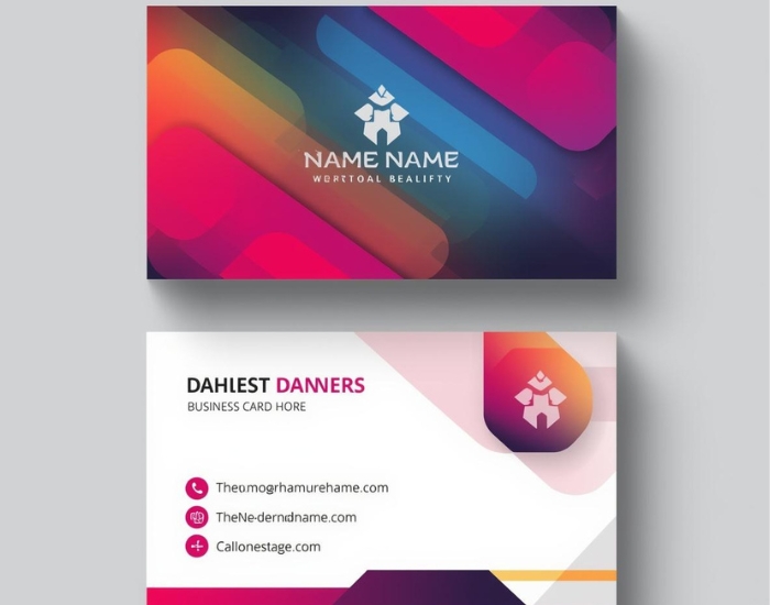
A construction logo makes a statement when it looks strong, professional and instantly readable. The best construction industry logos use relevant imagery, colors that signal trust, bold and clear typography, and a simple design that works everywhere from a business card to a truck door or hard hat.
The construction industry is competitive, and a strong brand identity helps you win trust before you ever bid on a job. A well-designed logo captures the essence of your business and communicates professionalism and expertise to potential clients. Here is why your logo matters and how to create one that stands out.
Why Your Logo Matters
The First Impression Counts
- Instant recognition: Your logo is often the first thing potential clients see, on a job-site sign, a truck or your website. A memorable logo creates a positive first impression and encourages people to look into your services.
- Professionalism: A well-designed logo conveys trust and reliability, qualities that matter in a field where safety and quality are paramount.
Differentiation in a Crowded Market
- Stand out: Many construction companies compete for the same clients. A distinctive logo helps set you apart and makes your company easier to remember.
- Brand loyalty: Clients are more likely to return to, and refer, a company with a strong, consistent visual identity.
Key Elements of Effective Construction Logos
Symbolism and Imagery
Symbols related to construction, such as tools, buildings, beams, roofs or hard hats, can immediately communicate what your business does. Keep them simple so they stay recognizable at small sizes. Regional touches can also help create a local connection, as long as they don’t clutter the design.
Color Choices
The colors you choose shape how your logo is perceived. Common associations include:
- Blue: often linked with trust and reliability
- Orange or yellow: energy, visibility and a nod to safety gear and equipment
- Green: growth and sustainability, relevant for eco-focused builders
Whatever you pick, make sure your logo colors match your overall branding so everything looks cohesive across all platforms.
Typography
- Readable fonts: Clean, bold fonts reflect the sturdiness of your brand. Avoid overly decorative fonts that are hard to read from a distance.
- Professional appearance: Strong, solid lettering tends to suggest stability and strength, which suits most construction audiences.
The Role of a Professional Logo Designer
Expertise and Experience
Professional designers know how to turn your vision into a clear, effective mark. They can also keep your logo looking current without chasing short-lived trends.
Tailored Solutions
- Custom design: Unlike DIY templates, a custom logo can reflect your specific services, values and mission.
- Collaboration: A good designer takes your input and feedback seriously and refines the design until you are happy with it.
Logo Design Phoenix works with builders and trades through our construction logo design service and has dedicated pages for general contractors and roofing companies.
Maintaining Your Logo’s Integrity
Keep Clean, High-Quality Files
Over time, logos can become blurry or distorted when they are copied, resized or recreated from low-quality images. Keeping proper vector files of your logo means it stays crisp and consistent on your website, signage, vehicles and printed materials. If you only have a pixelated version, logo vectorization can recreate it as a clean, scalable file.
Refreshing Your Logo
- Periodic updates: As your business evolves, you may want to refresh your logo. This usually means modernizing a few details rather than starting over.
- Avoiding confusion: Keep updates subtle enough that existing clients still recognize you.
Designing for Future Success
Flexibility for Different Applications
- Scalability: Your logo should look good on a business card, a large banner and a website. A simple, vector-based design makes this possible.
- Different materials: Consider how the logo will look on hard hats, vehicles, uniforms and embroidered workwear. It should keep its impact in one color as well as full color.
Communicating Your Brand Story
- Reflect your values: Think about what your company stands for, such as quality, safety or craftsmanship, and how your logo can express it.
- Engage clients: A strong logo invites potential clients to learn more and builds a sense of trust.
Make Your Mark in the Construction Industry
A powerful logo is a valuable asset for any construction business. By focusing on imagery, color, typography and versatility, you can create a mark that represents your strengths and grows with your company. If you are ready for a logo that makes a statement, request a free consultation with Logo Design Phoenix.
Frequently Asked Questions
What should a construction company logo include?
Most effective construction logos combine a simple industry-related symbol, such as a building, tool or roofline, with bold, readable lettering. Colors should suit your brand and the design should work in one color too.
What colors work well for construction logos?
Blue is often used to suggest trust, while orange and yellow suggest energy and visibility. Green can suit builders focused on sustainability. The best choice depends on your brand and how it fits your wider marketing.
Will my construction logo work on trucks and hard hats?
It should, if it is designed simply and supplied as vector files. Testing the logo in one color and at small and large sizes helps make sure it looks good on vehicles, uniforms, hard hats and signs.